
A travel guide built for every screen and every kind of explorer.
Kairos is a travel guide and research website that uses its influence to help travelers discover and explore the best places to visit around the world.

We need a responsive travel website that works smoothly on desktop, tablet, and mobile devices to provide travel enthusiasts with an easy and engaging way to explore and research the best destinations.

Our core objectives were to collect their content, design clear wireframes, and build a responsive website using semantic HTML, CSS Grid, and Flexbox.

I contributed to the Kairos project as both the UI/UX designer and front-end developer. This role guided my focus toward the following areas during the project:
Front-End Development (HTML and CSS)
Responsive Design
UI/UX Design

Adobe Illustrator, Photoshop, and Stock
Figma
Microsoft Office
Miro (collaborative platform)
Mobile-First Design
Visual Studio Code
Organizing essential travel research to inspire and guide users worldwide.
Kairos’ content is organized around its primary services: helping users find locations through multiple prompts, assisting with trip planning, and sharing blogs with tips and tricks for before and after their travels. For the content collection process, I used Miro to document information before moving on to wireframe design.


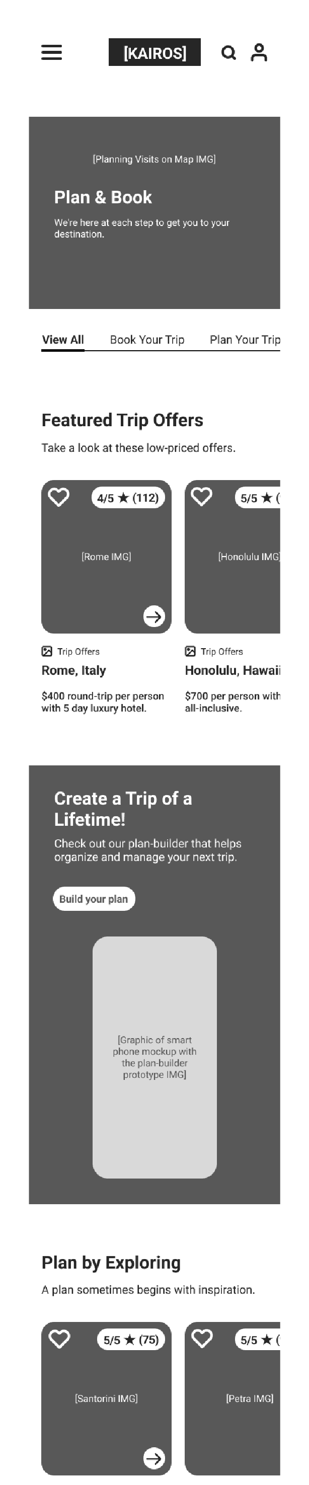
Wireframing the travel guide and research web journey.
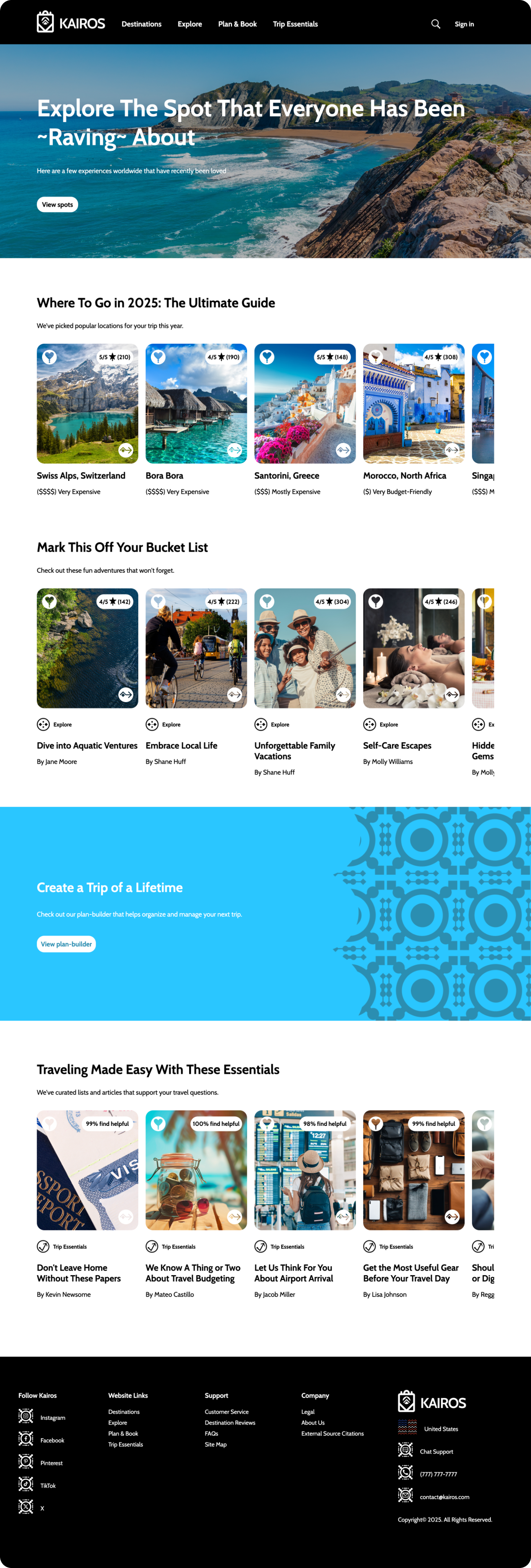
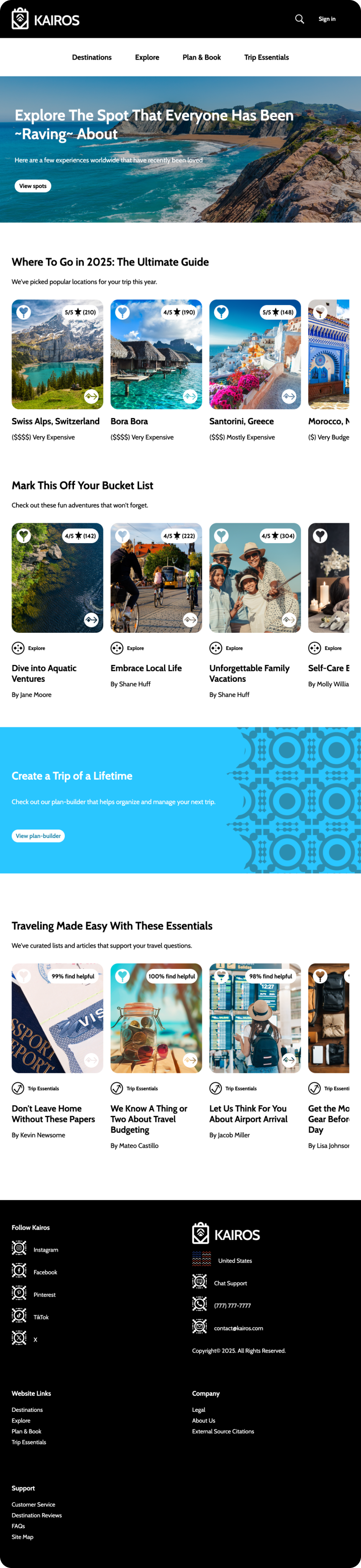
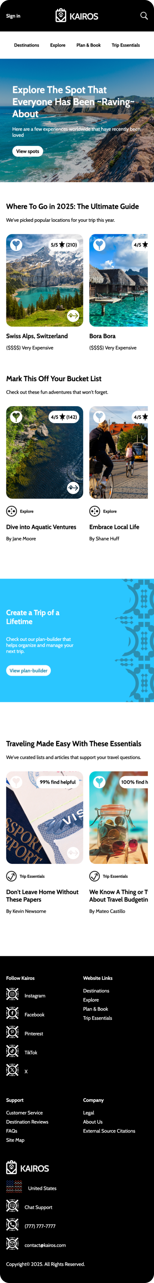
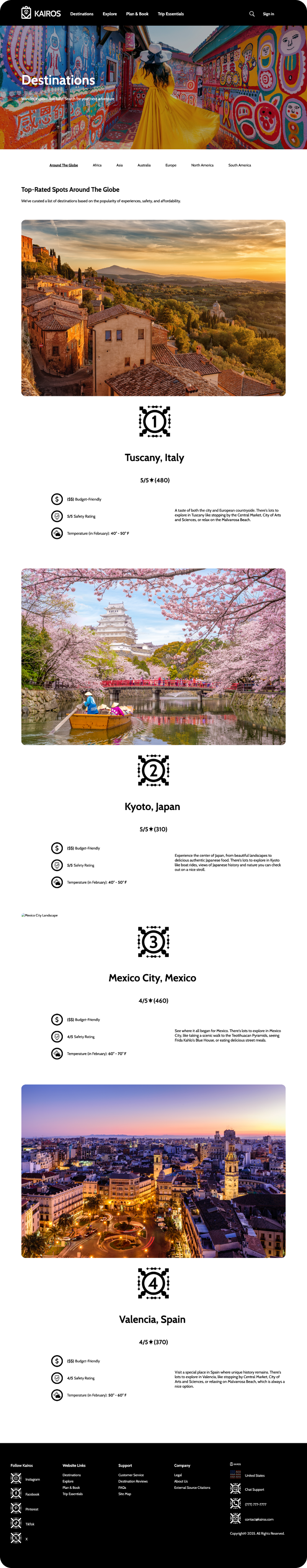
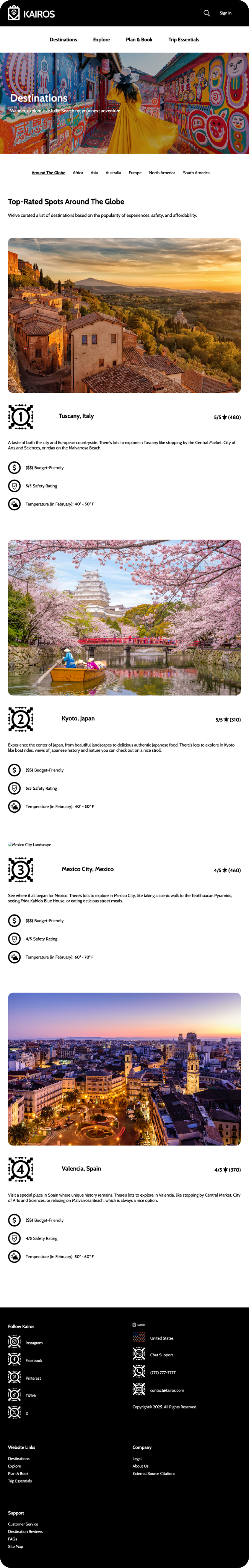
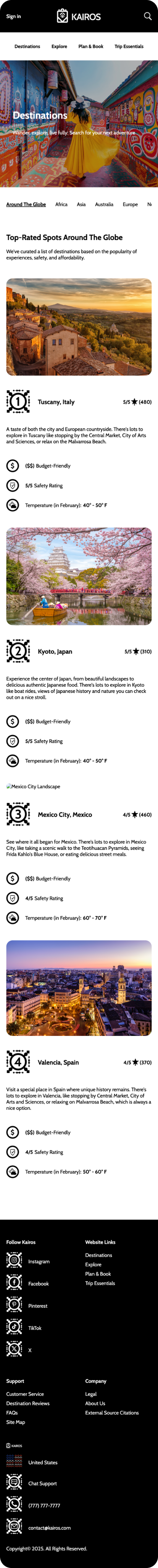
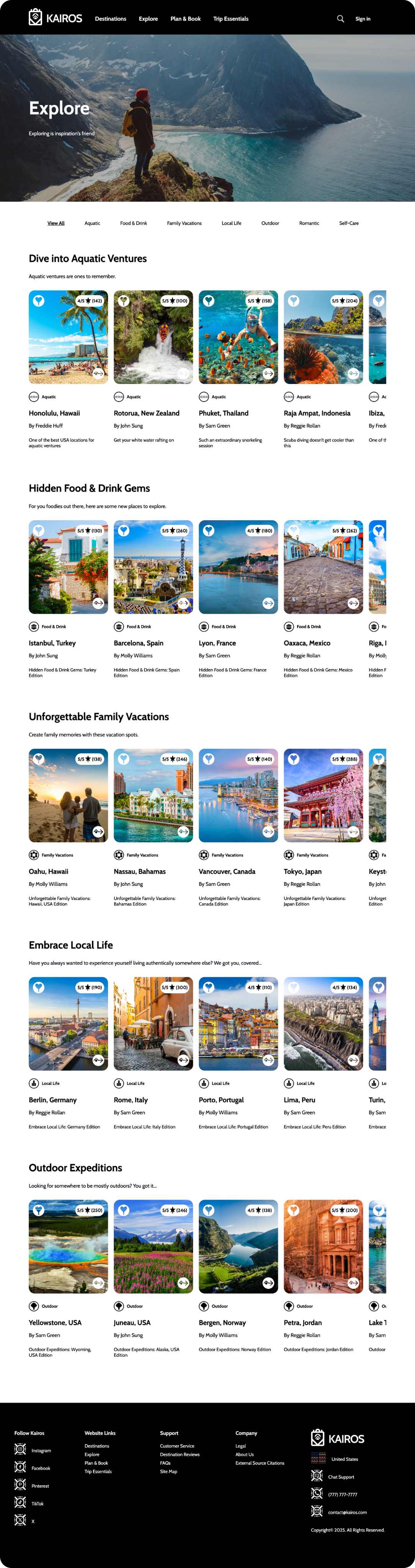
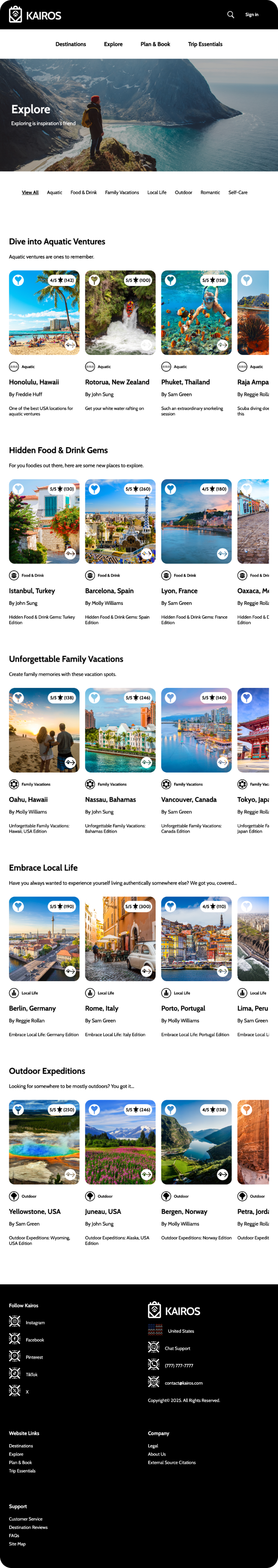
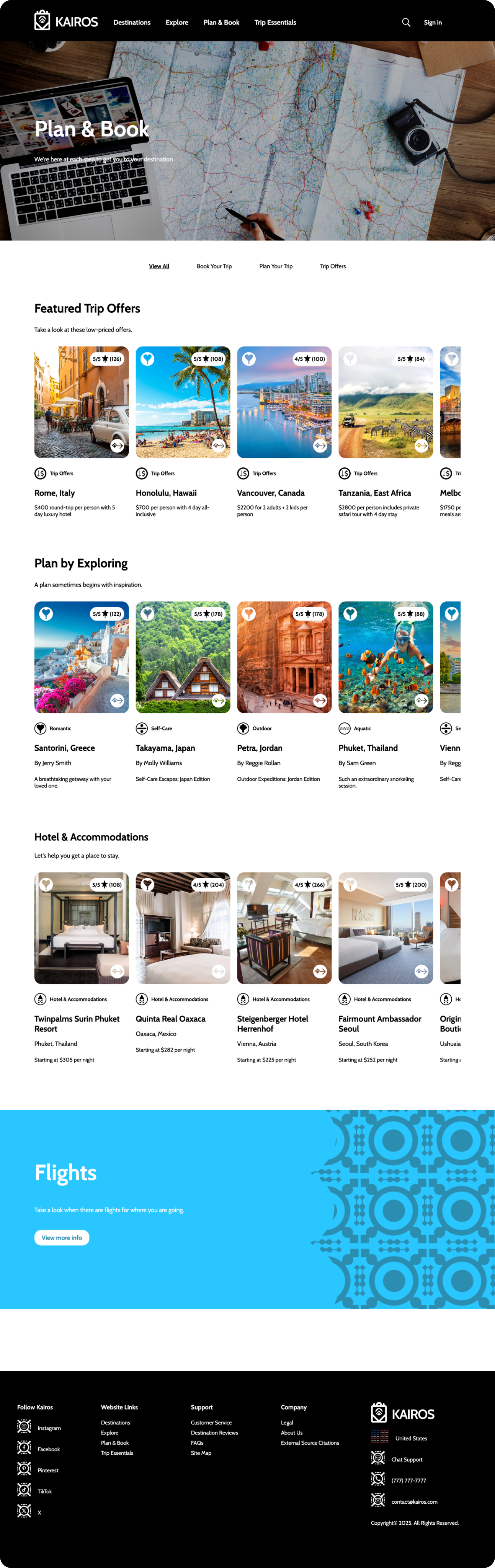
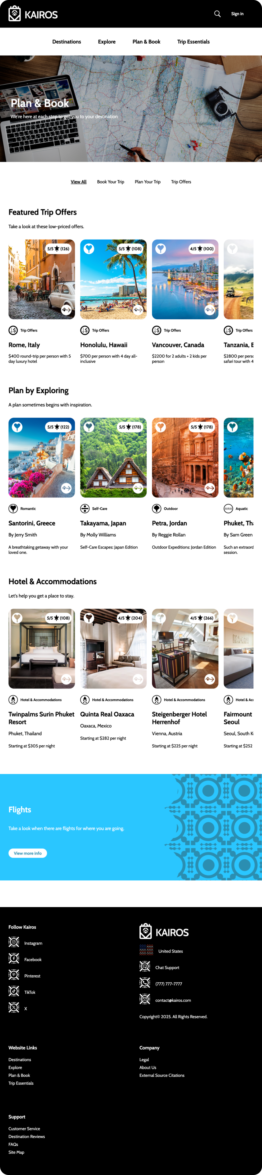
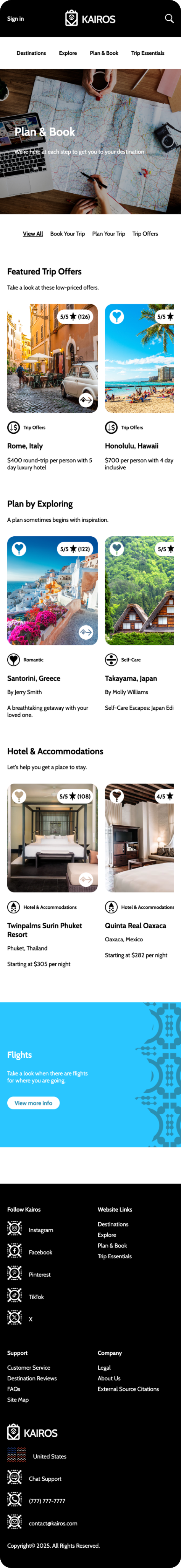
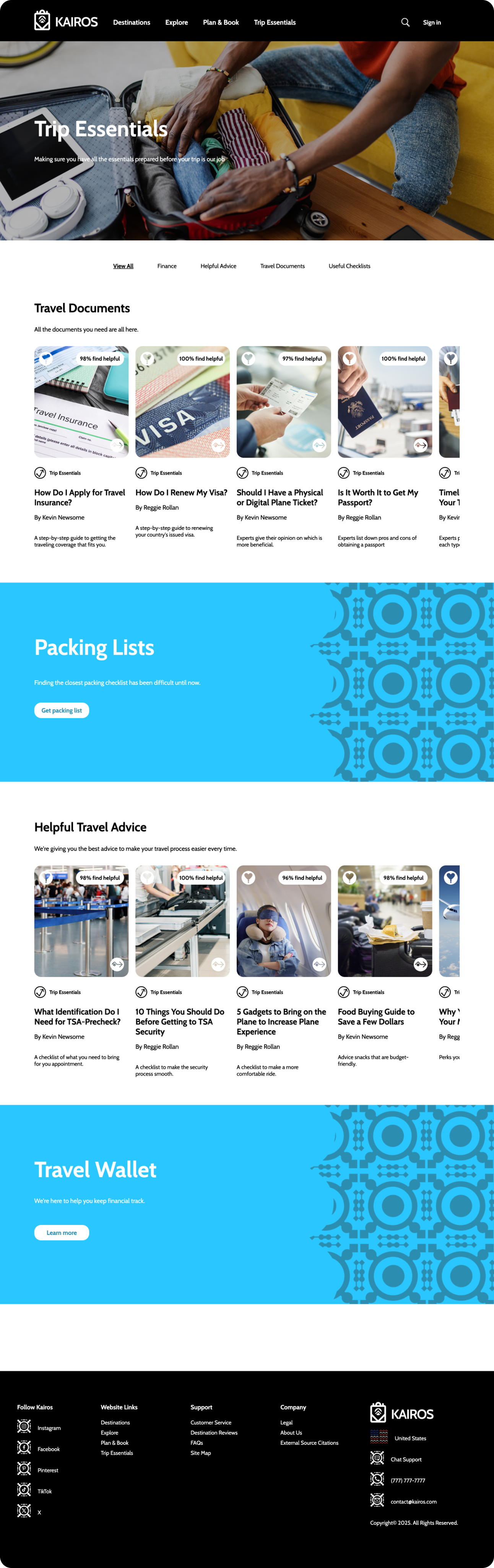
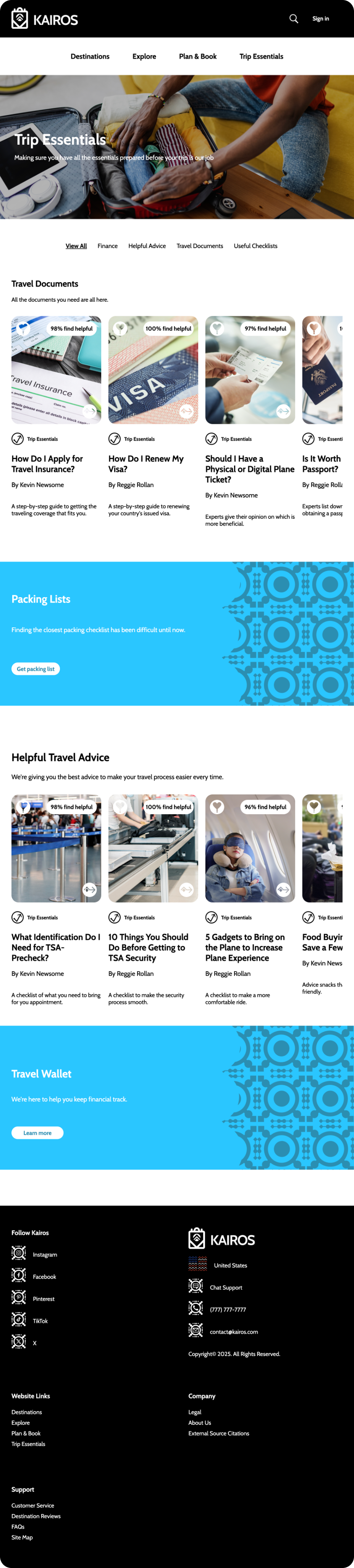
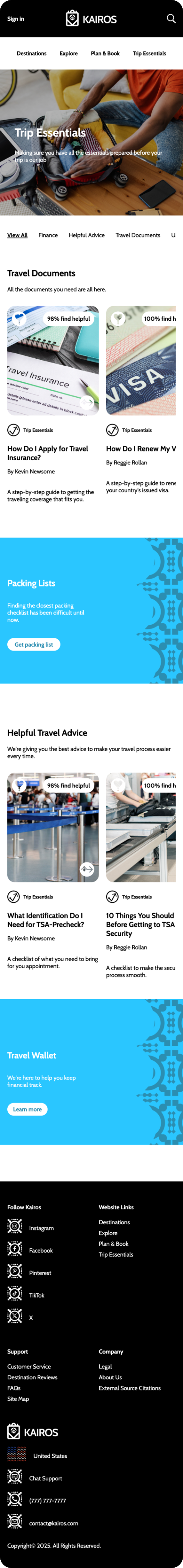
The wireframe was created using a mobile first design approach to ensure proper alignment across desktop, tablet, and mobile devices. With this in mind, I incorporated UI elements suited for responsiveness such as cards to display information and tab menus for filtering content. These elements help maintain a consistent layout while allowing more information to be visible on larger screens, enabling smooth transitions between devices and enhancing user satisfaction.


Where vision becomes reality: transforming wireframes into a responsive web experience.
Kairos is now a fully responsive website that works smoothly on desktop, tablet, and mobile devices. This is delivered as a five-page (5) website that gives users the capability to explore and research the best destinations for their next adventurous trip. The layout of this website primarily relied on two frameworks: I used CSS Grid to divide each section into named areas, creating a clear structure for organizing rows of graphics, titles, descriptions, and information cards. CSS Flexbox was used to place and align UI elements precisely.