
Inspired by the past. Designed for the present. Made to be lived with.
Juni is an Iowa City based shop offering unique home goods and handcrafted ceramics, now expanding nationwide through a thoughtfully designed e-commerce experience.

Develop a brand identity and apply it to a full e-commerce website prototype for Juni, a forward-thinking home goods company. The experience should support users through every stage of the online shopping journey, from browsing products and adding items to the cart to entering payment and shipping details, all with a clear, intuitive, and user-centered design.

My core objectives were to effectively collaborate with team members, clients, and supervisors to deliver thoughtful, strategic design solutions. This involved clear communication, responsiveness to feedback, and the ability to translate marketing concepts into compelling visual outcomes.

I contributed to the Juni collaboration as the multidisciplinary design lead of brand identity, UI/UX design, and user research. This role guided my focus toward the following areas during the project:
Brand Identity
UI/UX Design
User Tests & Research

Adobe Illustrator, InDesign, and Photoshop
D.E.C.I.D.E. UX Evaluation Framework
Figma
Microsoft Office
User Interviews and Usability Test (conducted via Zoom)
User Questionnaire (compiled via Google Forms)
A brand identity that grows naturally.
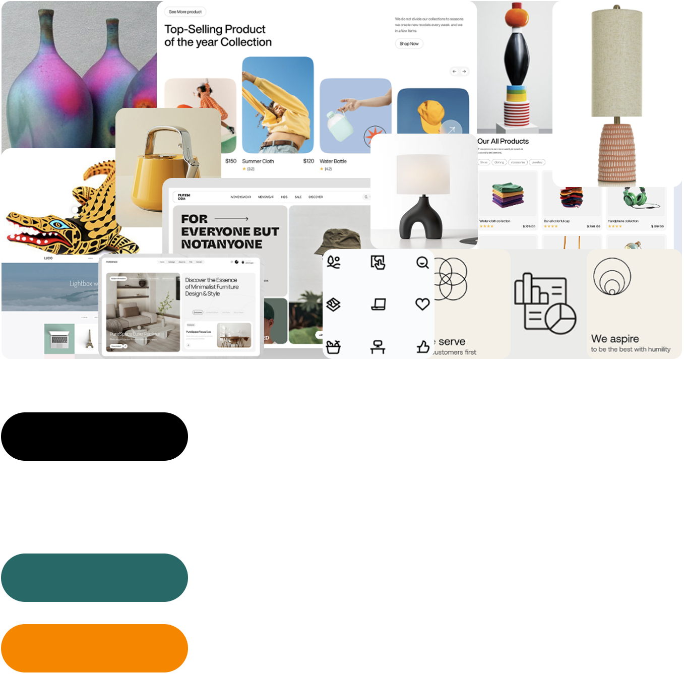
Juni’s brand identity expresses modernism, boldness, cleanliness, friendliness, and a strong connection to ecology. These values are carried through the cohesive design of products created by the in-house art team. To support a clean and non-loud web interface, a graphics and iconography library was developed using solid colors and a minimal style, allowing promotional and product imagery to remain the primary hierarchy focus.
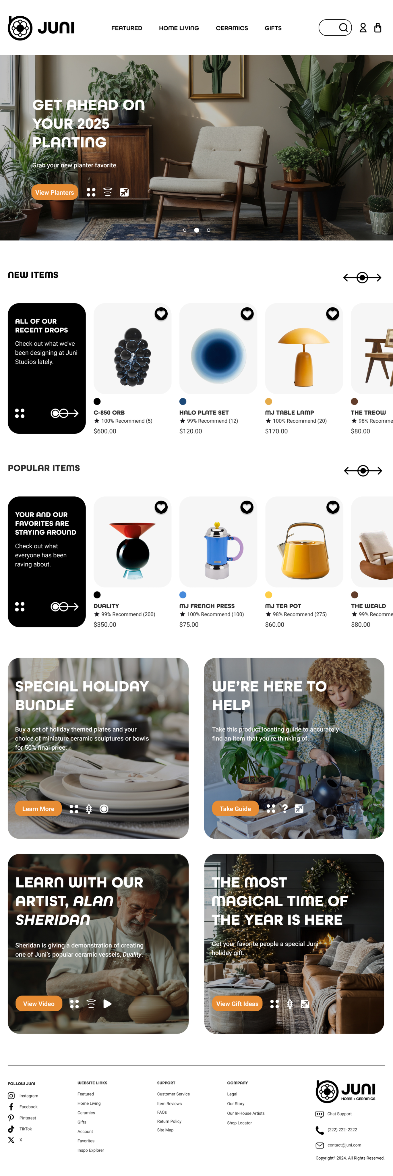
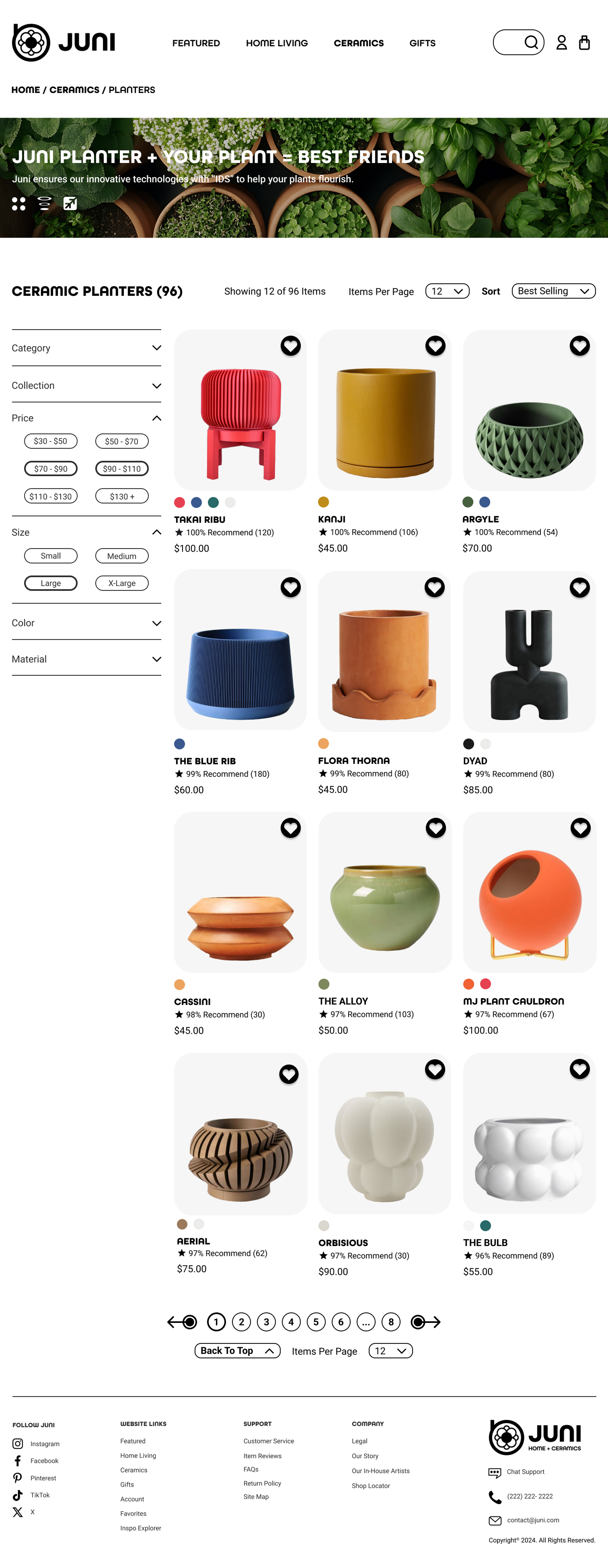
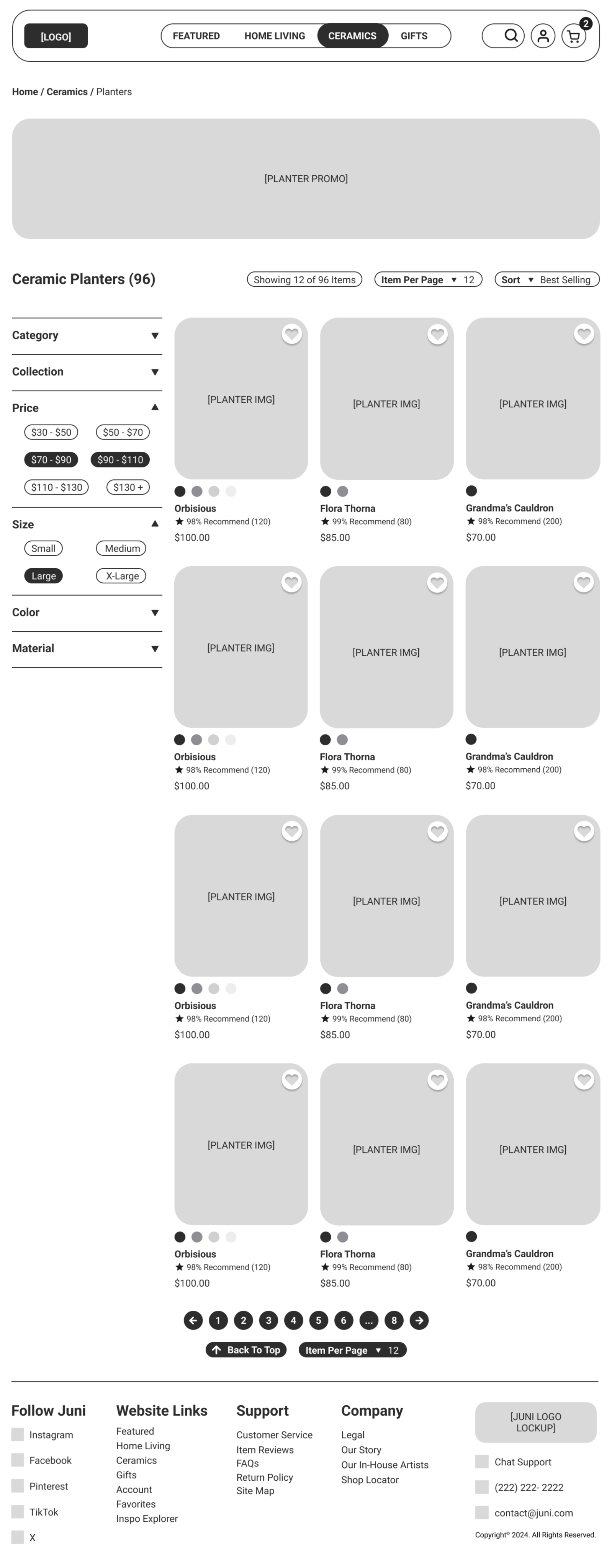
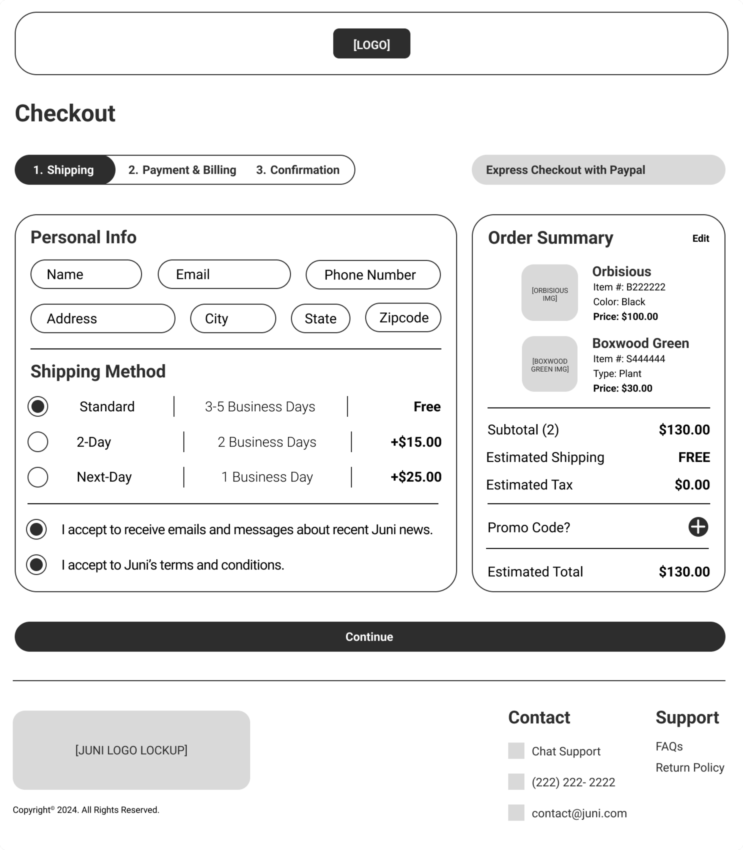
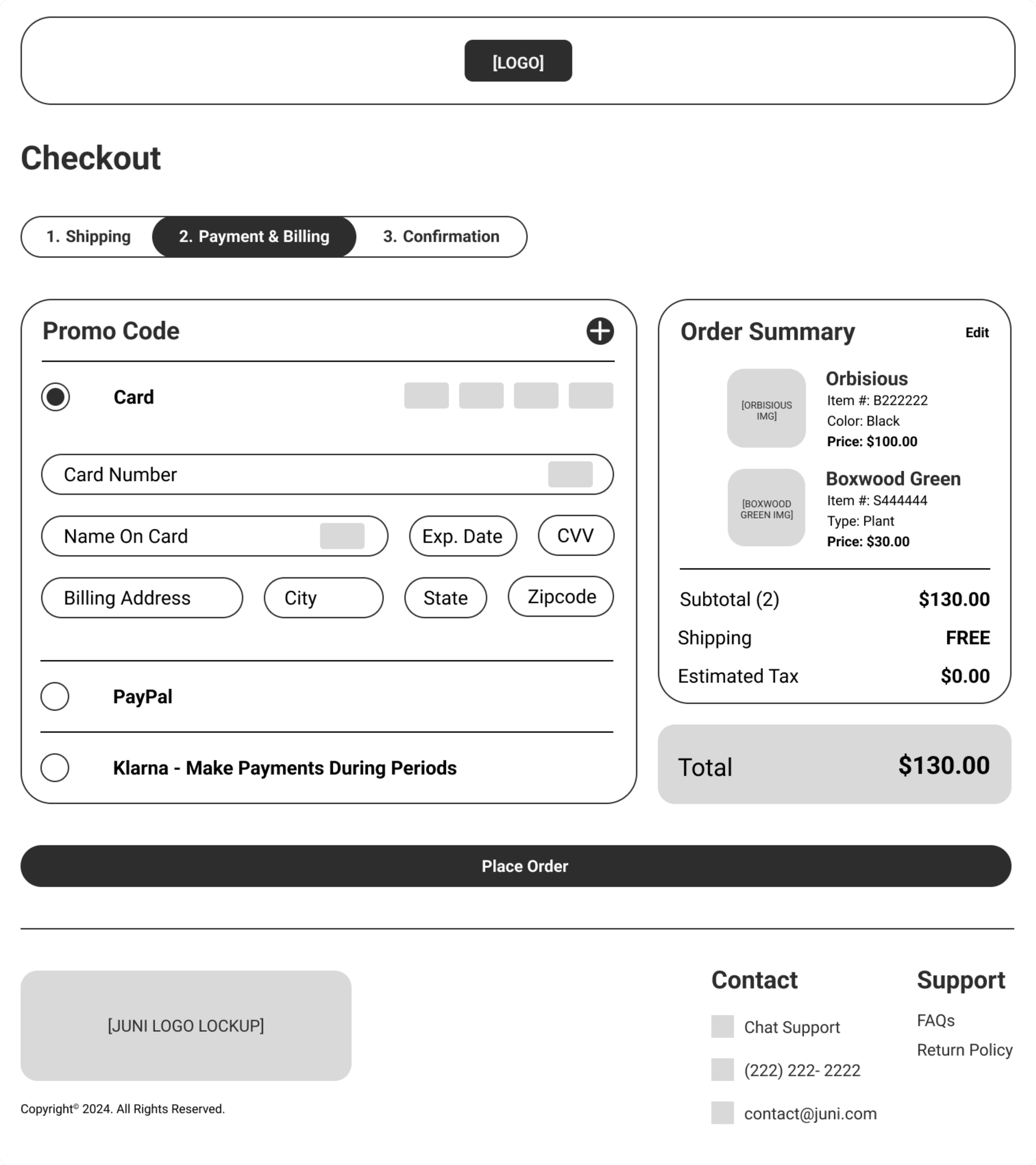
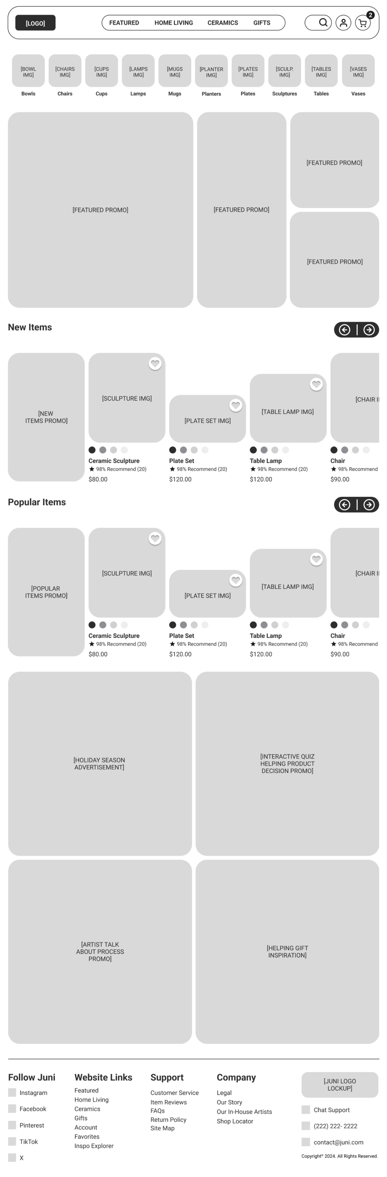
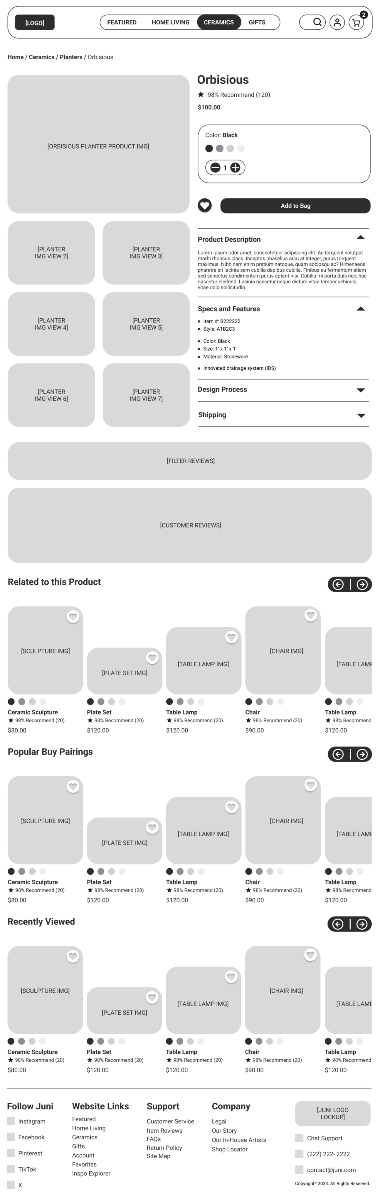
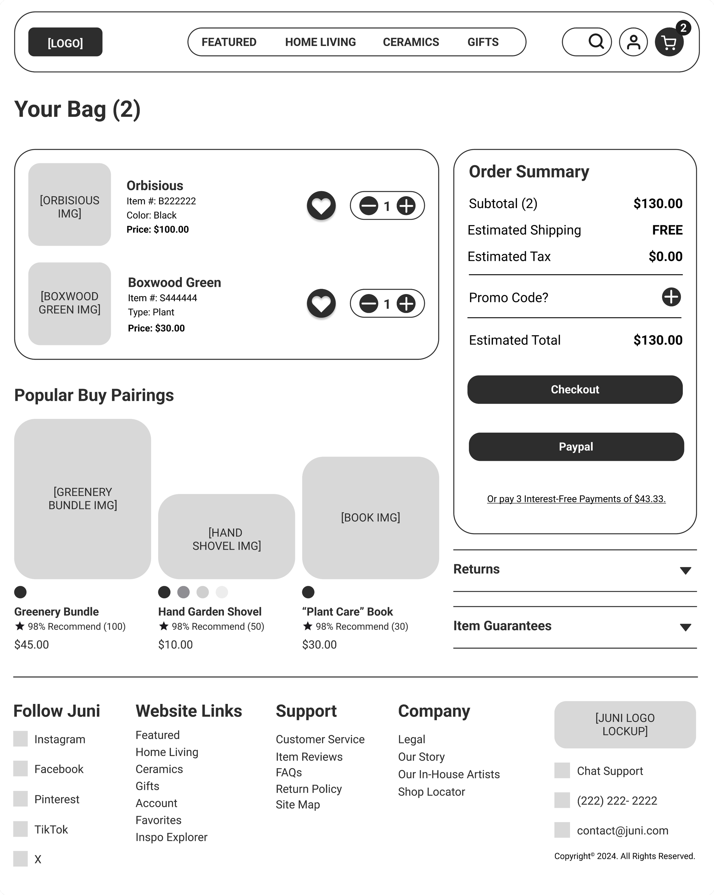
Wireframing the home goods and ceramics e-commerce journey.
Organization, intuitiveness, and uniqueness were the aims of this design wireframe, as these qualities are always needed for e-commerce websites. There is an emphasis on uniqueness due to the saturation of e-commerce layouts and aesthetics, and the idea was to create small details that differentiate this website. For example, an interesting entry point into the categories page was designed, with the beginning modular for each category, as users typically read from left to right.


What we learned from users and how we purposely reshaped the design.
To conduct effective user testing and research on Juni’s website, we followed the D.E.C.I.D.E. evaluation framework. This approach guided each phase of the process with user participants: Determine the goals, Explore the questions, Choose the evaluation methods, Identify practical issues, Decide how to address ethical concerns, and Evaluate, analyze, interpret, and present the data. Based on the data, we improved and iterated on design elements that users found confusing or problematic.
-
Goals:
The top-prioritized goal of this user evaluation is to understand the current usability and user experience proficiency through user flows embedded into Juni’s website.
An additional goal of this user evaluation is to analyze whether users feel secure, relaxed, and confident engaging with Juni’s website. There are anxious-related responses processing payments and sharing personal information with websites, and it’s Juni’s goal to put users at ease using the website.
Approach:
Pre-Usability Test Interview
Usability Test Observation
Post-Usability Test Questionnaire
-
User 1
Female
Age - 47
Occupation - Education Consultant
Related Experience? - Yes
User 2
Female
Age - 22
Occupation - University Student
Related Experience? - Yes
User 3
Female
Age - 21
Occupation - Lab Research Assistant
Related Experience? - Yes
User 4
Male
Age - 20
Occupation - University Student
Related Experience? - No
User 5
Male
Age - 23
Occupation - Military Solider and Mechanic
Related Experience? - Yes
User 6
Female
Age - 22
Occupation - Pharmacy Technician
Related Experience? - Yes
-
A pre-usability test interview will be conducted to learn more about the user and their previous experience using e-commerce websites. The following questions will be asked during this phase:
What is your common goal when visiting an e-commerce website? Is your intention only to browse for inspiration or entertainment, or does browsing lead to purchasing a product?
Have you used a home decor or ceramics website before like West Elm, Magnolia, IKEA, Wayfair, or similar websites?
How did you feel about browsing, locating, and checking out of a previous related e-commerce website? Was it a good or bad experience, and why?
As an estimate, how long does it typically take to complete a checkout process when your payment is not already pre-saved?
Are there any final questions before we begin this usability test of Juni Home Living + Ceramics?
-
During this usability test observation, the user will be instructed to think out loud while engaging with the website to understand what the user feels and thinks while performing tasks. The user will then be asked to perform five tasks to measure whether Juni meets its usability goal benchmark set by its competitors, such as West Elm, Magnolia, IKEA, or Wayfair. The five tasks will be asked on a begin, perform, and completion basis to reduce task confusion or feeling overwhelmed. For instance, the user will be instructed to begin task one, perform, complete, and then ask for the next task while being observed. The usability tasks are stated by the following:
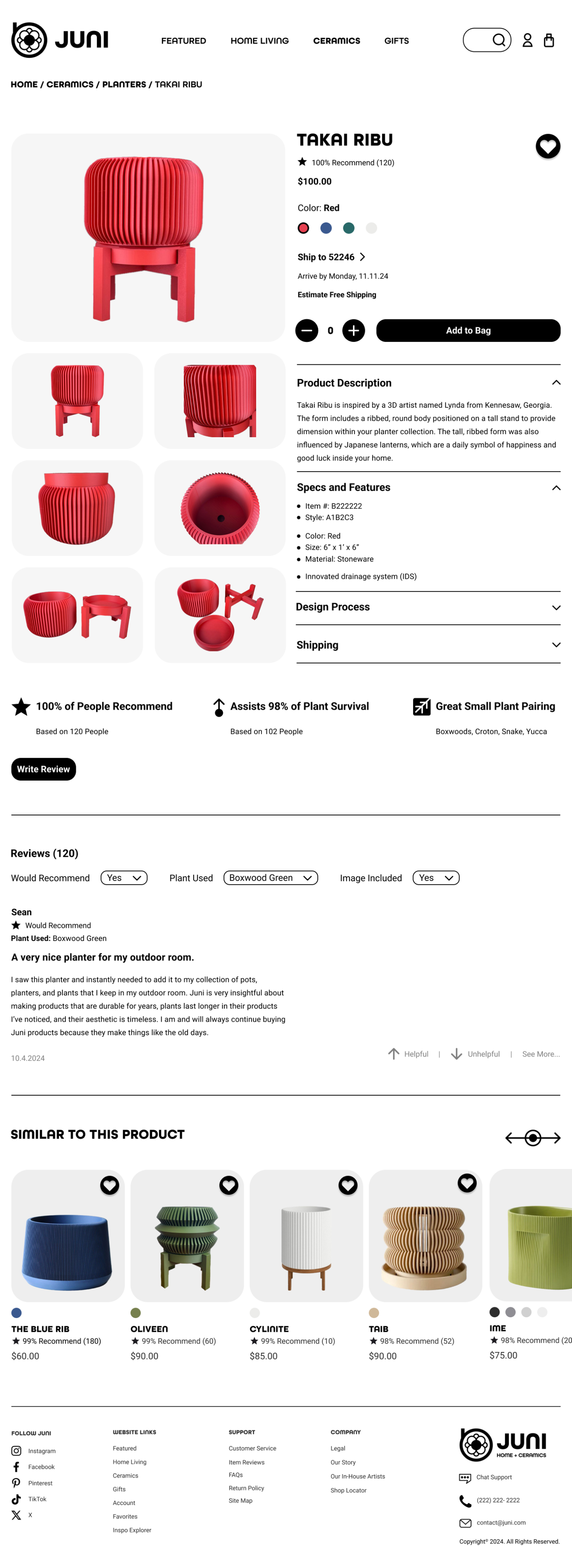
Beginning at the homepage, find where to purchase a ceramic planter named “Takai Ribu” and select the product once you locate it.
Ensure that you choose the red color of the “Takai Ribu” planter, add it to your bag, and locate the checkout bag to begin the checkout process.
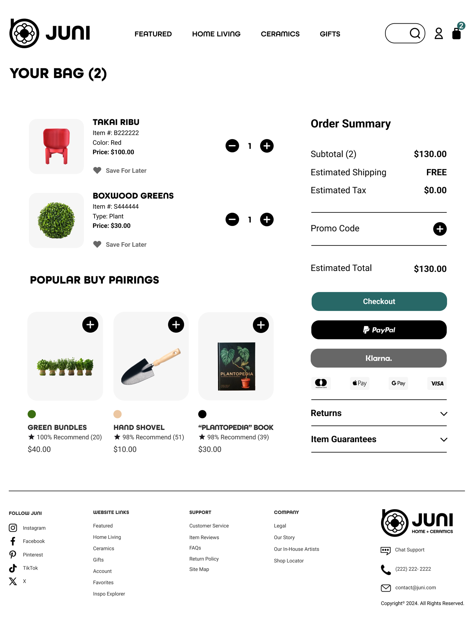
Review your bag. Is it correct? Do the product color, quantity, and prices all align? If so, continue to checkout.
You will choose to have your order shipped standardly free and paid by a credit card. With that information, complete the rest of the checkout information and place
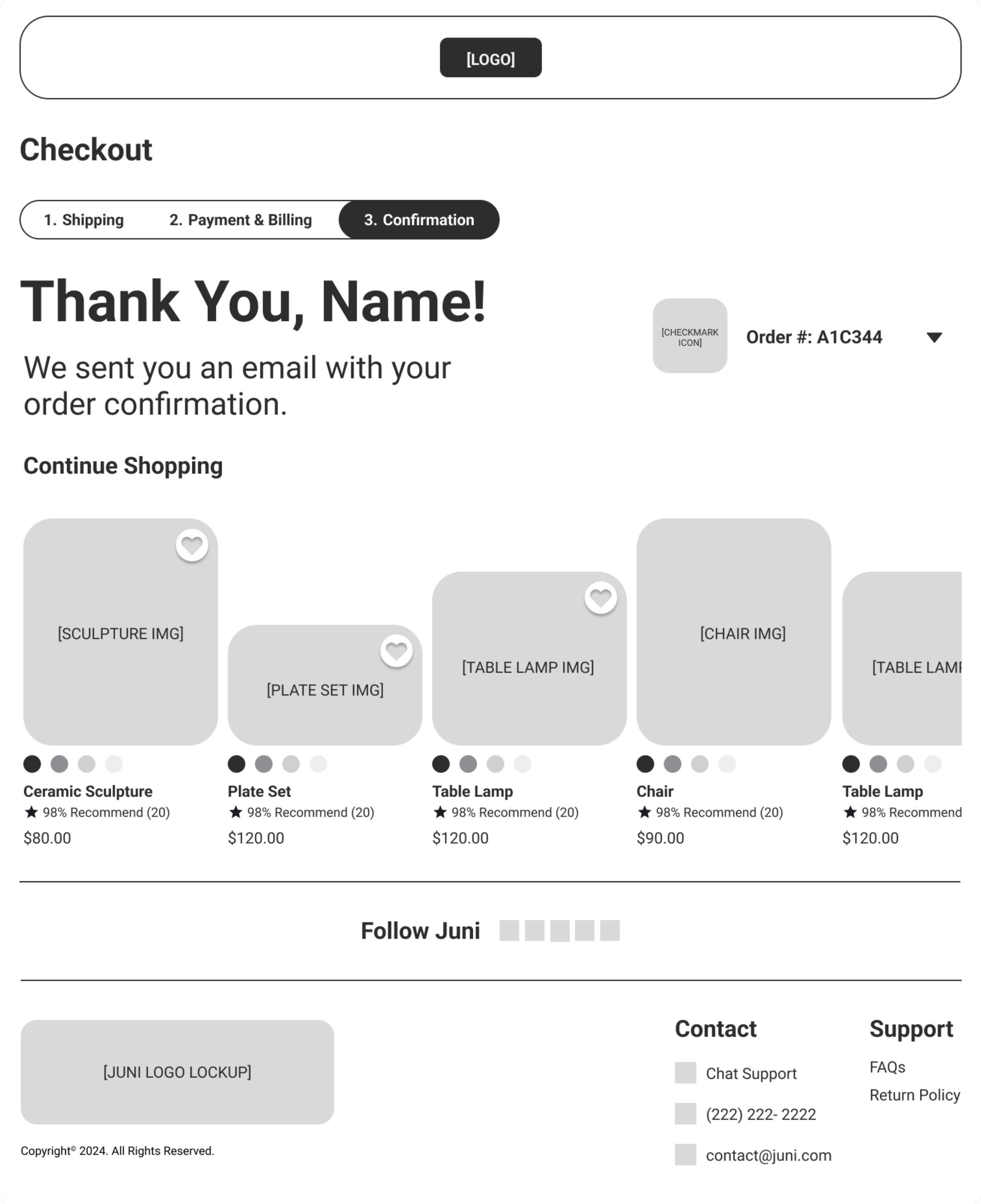
your order.Once the order is placed and confirmed, return to the homepage.
-
This post-usability test questionnaire will provide honest, non-pressured feedback from user participants about their experience engaging with Juni's online presence and answer the questions explored in the evaluation's goals. It consists of 13 questions written in a first-person perspective to ease the decision-making process on the strongly disagree (1) - agree (5) scale:
It was straightforward to locate the “Takai Ribu” ceramic planter going from the homepage to the category’s webpage.
Adding the “Takai Ribu” ceramic planter to the bag and then locating the checkout bag was straightforward.
The order summary to the right in the checkout bag webpage was easy to understand. I knew what every label was asking or telling me what to do.
I was confused or overwhelmed during any phase of the checkout process (Shipping -> Payment -> Confirmation webpages).
It was straightforward to know what shipping and payment information to enter into each fill-in box on these webpages.
It was straightforward on which button to choose to continue to the next webpage in each checkout phase (Shipping -> Payment -> Confirmation -> Home webpages).
In a scenario where I was not paying with a credit card, there were enough other payment options to pay for the product (PayPal, Apple Pay, etc.).
It was straightforward to get back to the homepage from the order confirmation webpage.
I felt like this website was legitimate and sold high-quality home decor and ceramic products.
I felt secure and relaxed while using the website and did not feel like this website would steal my personal and payment information.
The website branding and aesthetics helped the website feel more legitimate.
I would come back and use this website again based on my finding a product and checking out experience.
This website was as high-quality as the competitors, such as West Elm, Magnolia, IKEA, or Wayfair.
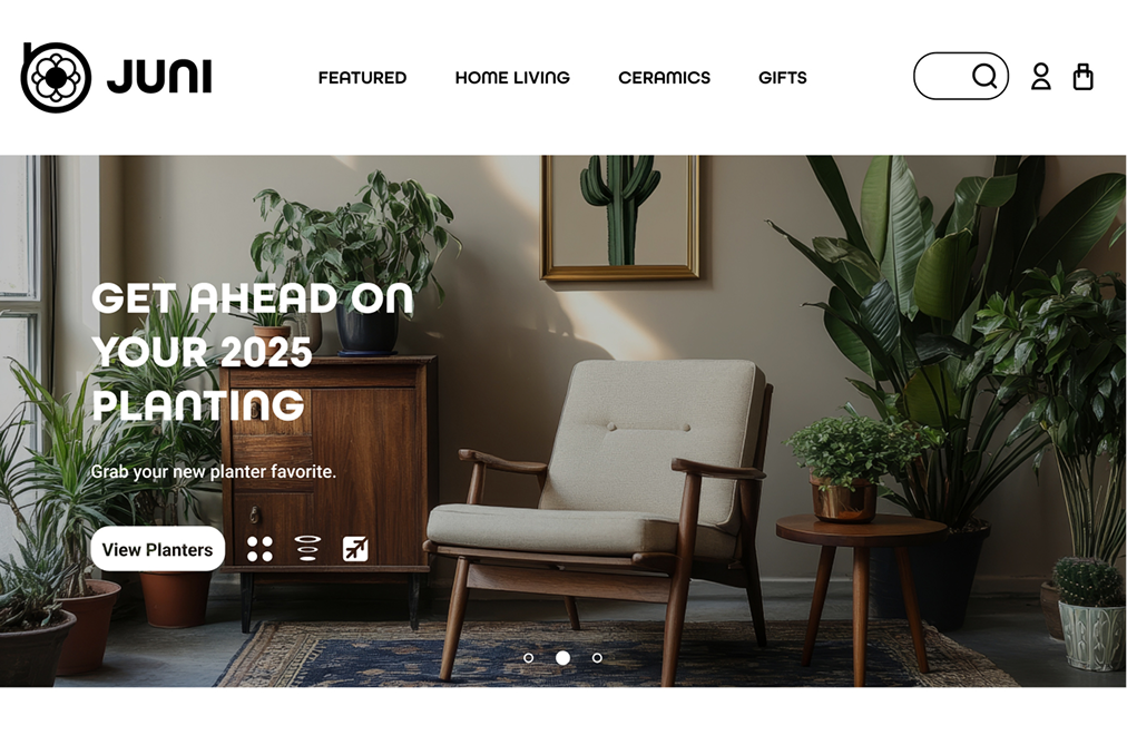
(Before Usability Test)
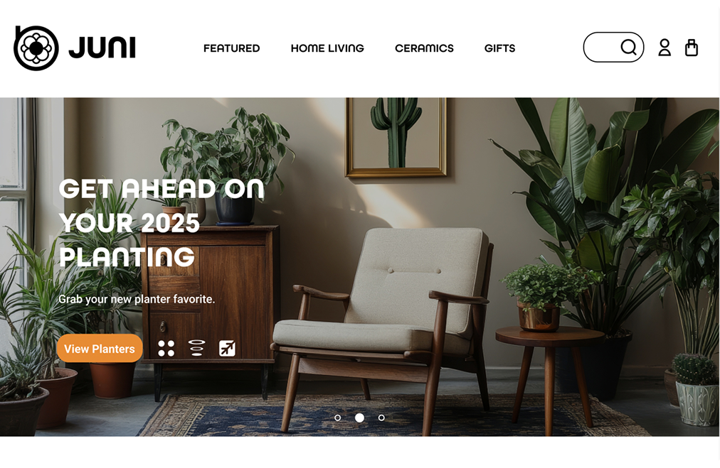
(After Usability Test)
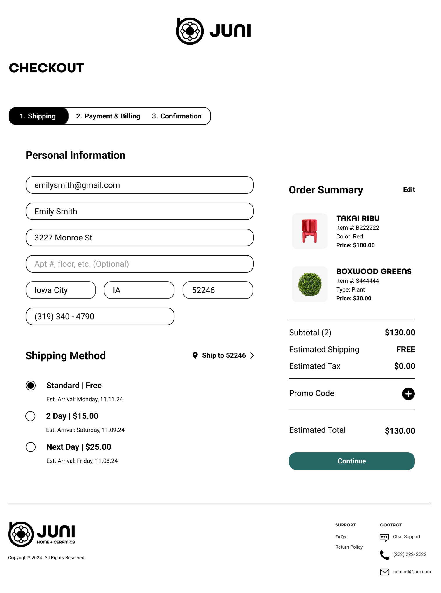
Users had trouble finding the easiest way to get to the “Takai Ribu” ceramic planter from the homepage. To improve this, we changed the call-to-action button to a bold orange so it would stand out more in the promotional section and draw users' attention.
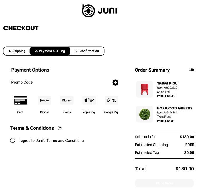
(Before Usability Test)
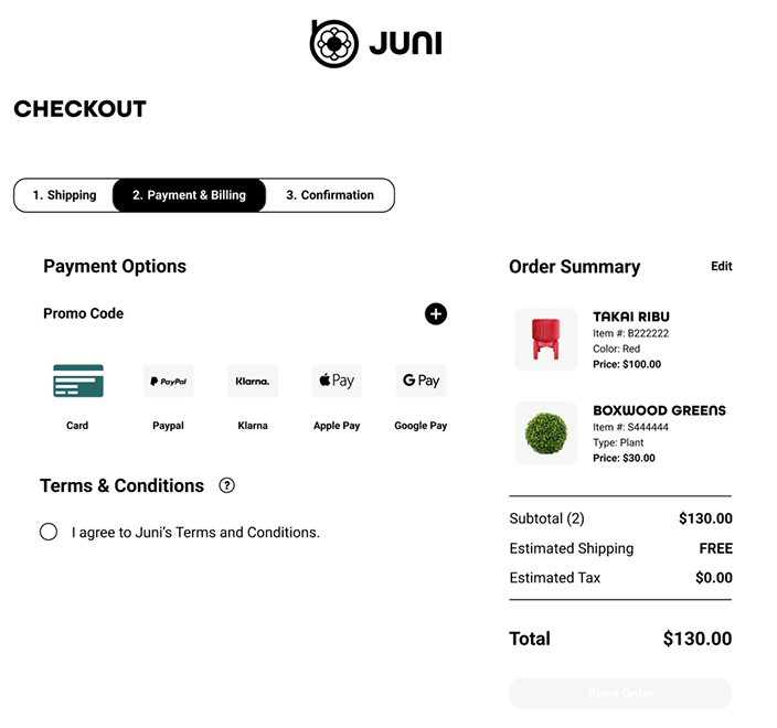
(After Usability Test)
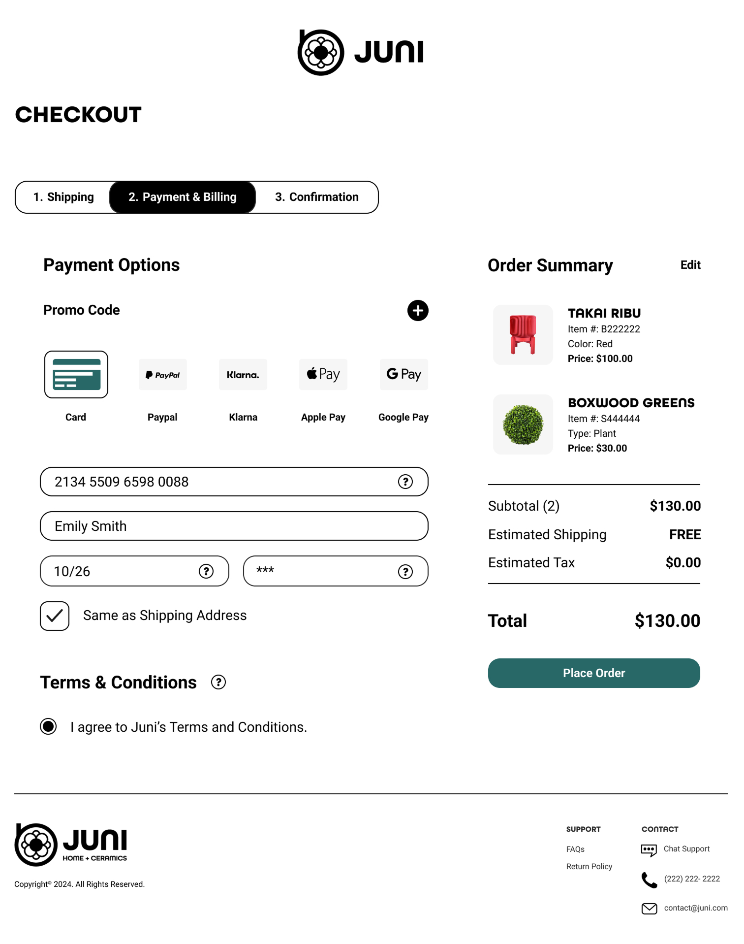
Users often overlooked the first step of selecting a payment option, jumping straight to accepting the terms and conditions. To solve this, we implemented an autofill selection element and used a bold green button to draw attention to the first step, while maintaining a consistent and cohesive design across the webpage.
(Before Usability Test)
(After Usability Test)
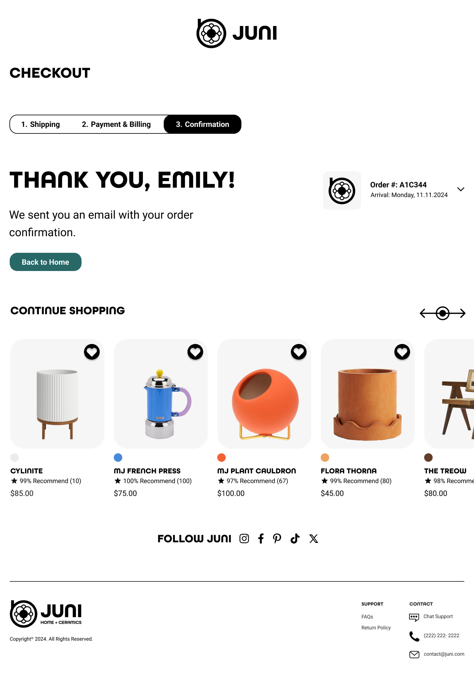
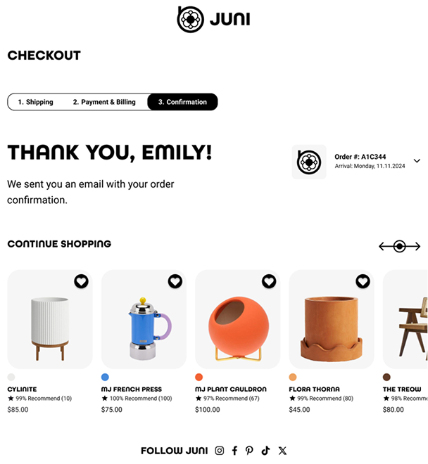
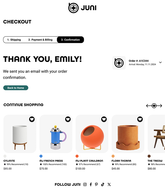
Users found it challenging to return to the homepage after receiving an order confirmation. To make this process more intuitive, we added a bold green “Back to Home” button on the webpage, allowing users to easily navigate back to the homepage.
Where vision becomes reality: transforming wireframes and user insights into a fully interactive experience.
Juni has now expanded nationwide through a thoughtfully designed e-commerce experience. This is delivered in a seven-page (7) web prototype that guides users seamlessly through the journey of ordering home goods and handcrafted ceramics.