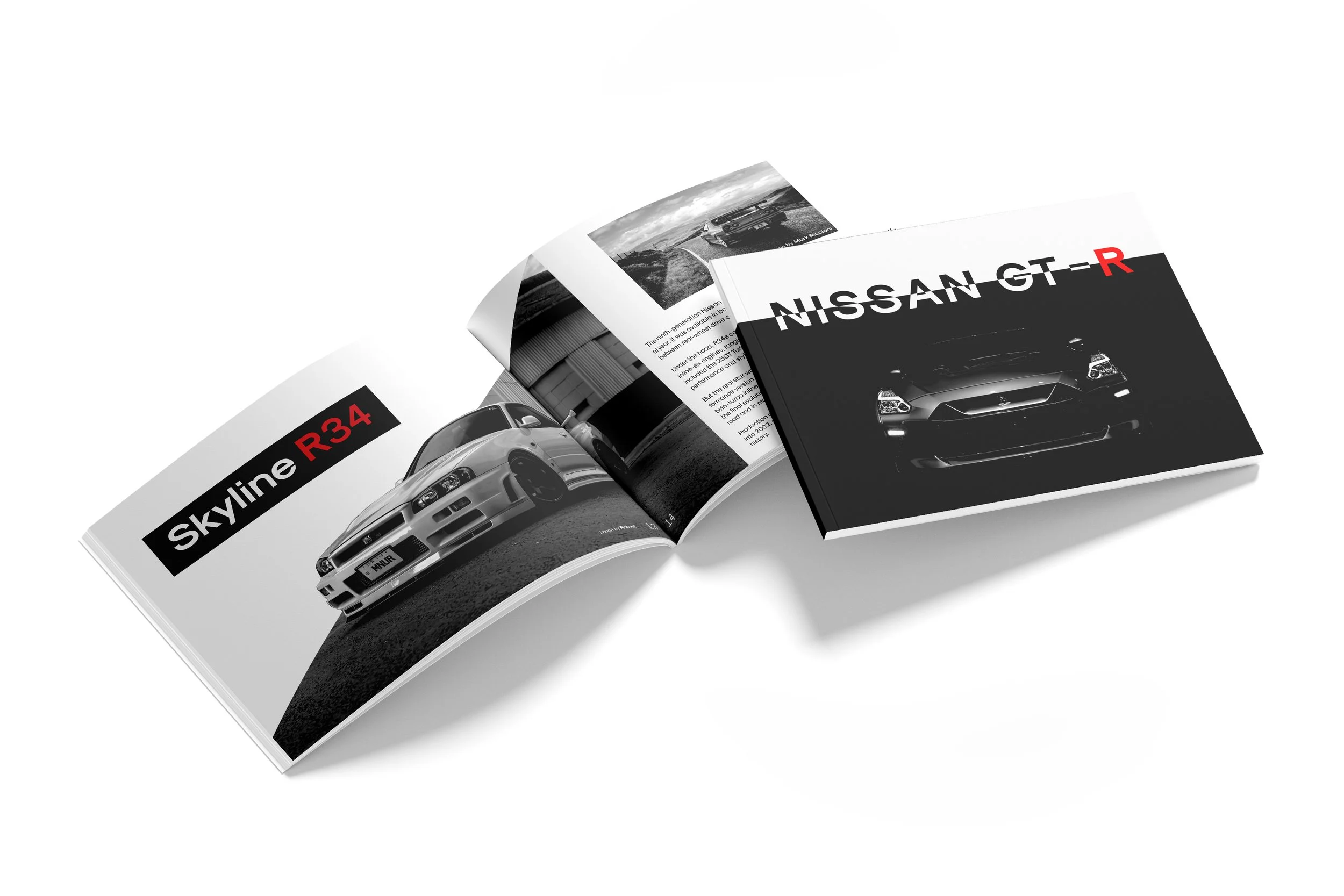
Built for speed. Shaped by legacy. Driven by type and image.
This GT-R magazine takes readers on a visual journey through the evolution of an automotive icon.

Create a magazine that explores the theme of connection through the intentional integration of imagery and typography. Use layout, type hierarchy, image selection, and visual storytelling to reinforce this concept throughout. The final design should feel cohesive and purposeful, evoking a strong sense of unity between visuals and text.

Visually express how people, places, objects, or ideas are connected, whether emotionally, physically, culturally or technologically, by crafting design solutions that highlight meaningful relationships and shared narratives.

I contributed to the GT-R magazine as the graphic designer. This role guided my focus toward the following areas during the project:
Post-Processing Photography
Print Collateral (magazine)

Adobe InDesign and Photoshop
Yellow Image Mockups