

RevRanger is an automotive trading website that provides the most simplicity and reliability for users when buying, selling, and doing vehicle research.
The automotive’s asked me to develop their brand identity and create a design prototype with UI patterns to expand user-friendliness for this website. RevRanger wanted approaches for users to buy and sell their vehicles, research a new potential car, and save it to their account. In order to accomplish this, I began by making their graphic and iconography library, then transitioned into a design wireframe and a final website prototype.
Client: RevRanger (2024)
Deadline: 3 Weeks
What I Accomplished:
-Web Design
-Brand Identity
Software Usage:
-Adobe Illustrator & Photoshop
-Axure
-Microsoft Word
RevRanger’s Branding
RevRanger’s brand identity is adventurous, modern, clean, and trustworthy, which ensures smooth user interaction and captures a sense of security while interacting with their website. As an automotive trading website, the image-heaviness was considered throughout, and creating clean and understandable graphics and an iconography library seemed most reasonable.


What Was The Thought Process Behind The Design Wireframe?
The layout of the design wireframe was built so that users could find the functions they were looking for by scrolling down each webpage and organizing them within modular boxes to maintain organization. The goal of the website is for users to search, whether that be to buy or sell their vehicle, which could be located by primary search on the homepage or various methods of continually seeking new vehicle information near the end of the webpages.


Which UI Patterns Did I Use for RevRanger?
RevRanger contains nineteen (19) UI patterns for users to view and know how to use effortlessly throughout this website. They include:
-
This pattern was used on the search results, vehicle details, and content submission web pages. It was essential to use in RevRanger’s user interface because it shows how the user arrived at that point by a span of organized pages at the top of the website, making it easy to return to a previous page.
-
This pattern was used on the home, search results, and vehicle details webpages. It was essential to use in RevRanger’s user interface because it’s familiar for users to understand, and it offers an opportunity to consistently provide vehicle images, information, and a call-to-action button in one place that increases readability.
-
This pattern was used on the home, vehicle details, and content submission web pages. It was essential to use in RevRanger’s user interface because it offers an organized approach to displaying data (cards and images) that is easily functional by pressing the button controls on the left or right sides to present focal content.
-
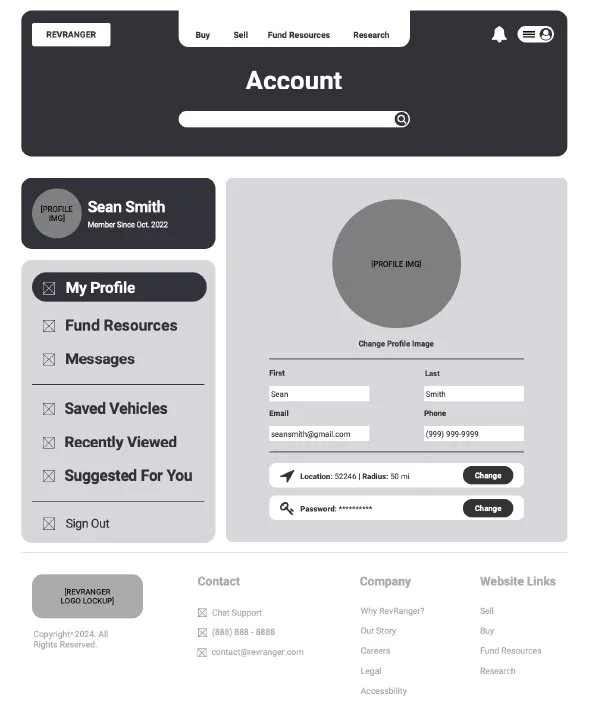
This pattern was used on all of the web pages. It was essential to use in RevRanger’s user interface because it focused on one crucial and relevant function or content practiced through a bold size, headline, or content. For example, the profile section associated with the modular tabs on the account web page contains 60-75% of the screen, making it apparent that this is what the user should be viewing and interacting with.
-
This pattern was used on the profile web page. It was essential to use in RevRanger’s user interface because it helps users contact vehicle dealers to advance in the buying, selling, financing, or research process. The pattern is demonstrated by having an inbox and all common chatting functions, like creating and receiving messages.
-
This pattern was used on all of the web pages, but most expressed on the homepage. It was essential to use in RevRanger’s user interface because it helps users know how to interact with the website once they land on it. For example, there is a grid of sections on the homepage that provide a clear entry point into finding a vehicle they spotted on an advertisement or social media, approaches to selling the user vehicle and get the most monetary value out of it, explore their budget and find cars in that range, and start the research process of finding a vehicle that fits them. Mostly, giving clear entry points into the top functionality of the website.
-
This pattern was used on the home and search results web pages. It was essential to use in RevRanger’s user interface because it provides an approach to organizing a long list and aesthetically and functionally hiding the list from out in the open by opening and closing the panel to save space and increase visual hierarchy.
-
This pattern was used on the search results web page. It was essential to use in RevRanger’s user interface because it helps narrow down on a vehicle that fits the user by providing the opportunity to apply a filter by selecting checkboxes that relate to components that users care about when buying a car, such as year, trim, transmission type, exterior color, etc.
-
This pattern was used on the search results, vehicle details, and content submission web pages. It was essential to use in RevRanger’s user interface because it helps users organize and save vehicles that they want to view later as an option. It also assists in the car buying process to save and compare when getting to the phase of decision-making of pursuing the ownership of that vehicle.
-
This pattern was used on the home, search results, and content submission web pages. It was essential to use in RevRanger’s user interface because it reduces time and energy filling out a form by either containing an accurate prefilled or default answer that assists the user through the form and is quicker due to some fields already being accurately prefilled. For example, when you enter the website, the vehicle searching form has prefilled “New, Any Make, Any Model, Zipcode (determined from external systems).” The user could select search and refine later if they choose to, but it reduces the time of filling it out if they do not want to.
-
This pattern was used on the home and search results web pages. It was essential to use in RevRanger’s user interface because it organizes content in an equal hierarchy way, which also helps with readability. For example, all search result cards are all the same size and, in a grid, to make comparing a quick and easy process.
-
This pattern was used on the home, vehicle details, and account web pages. It was essential to use in RevRanger’s user interface because it helps organize long lists of content, like a collapsible panel, but has an open concept, meaning the headings are all displayed and present content once selected. For example, the organized long list of functions and content within the account web page are displayed underneath modular tab categories such as fund resources, messages, saved vehicles, recently viewed, suggested for you, and sign out.
-
This pattern was used on the account web page. It was essential to use in RevRanger’s user interface because it helps notify users about dealers contacting them back or vehicles that are recommended to them. It was implemented so that users could use RevRanger as a one-in-all service and be a “middle-person” between the dealer and user, making the notification pattern crucial.
-
This pattern was used on the search results web page. It was essential to use in RevRanger’s user interface because it helps divide an extended list of items into separate pages to ease the cognitive load and increase website performance. For example, there are 260 results for “New, Honda, Accord, in a 20-mile radius of 52246,” and viewing all 260 results at once would be demanding and challenging. So, providing the option of selecting how many items a user would like to see per page sounds a lot more accustomed, like viewing 13 per page for 20 pages. The page number selector is also crucial within the pagination pattern and displaying six-page numbers with an option to see six more (choosing the ellipsis), and the opportunity to view the last page is essential for users to have the power to see and customize that view to ease the viewing process.
-
This pattern was used on the vehicle details web page. It was essential to use in RevRanger’s user interface because it’s crucial to see other people’s experiences with the same vehicle. You would not want to purchase a vehicle if others has issues with it. So, implementing a rate system pattern is crucial for users to engage and receive honest feedback about their future purchase.
-
This pattern was available on all web pages. It was essential to use in RevRanger’s user interface because it’s crucial to become associated with the auto trader website to save vehicles, message dealers, and get an algorithm to view fitting vehicle recommendations. Having that opportunity in the top-right corner of the website is important because that’s the first place users are going to look due to being a pattern.
-
This pattern was available on all web pages. It was essential to use in RevRanger’s user interface because users are always curious and wandering, and if you do not use effective titled sections, it can confuse them. Using this pattern is crucial because users will always look for titles to get a quick summary of what the section is about.
-
This pattern was available on all web pages. It was essential to use in RevRanger’s user interface because users are always looking for a quick way to determine whether they want to invest their potential energy and getting a preview of thumbnail serves that.
-
This pattern was available on all web pages. It was essential to use in RevRanger’s user interface because it provides the sameness of every page, meaning users can find elements and functions in the same spot or do not need to guess how to use them or where to find what they are looking for every page.
Interested in viewing more of RevRanger’s design prototype? Click here


